Communiteer platform //
How might we create a more community oriented approach to volunteering?
The platform is an all in one product offering that provides a community first approach to volunteering. It enables volunteers to connect with communities and causes of interest which allows for impact to occur in one’s causes of interest and passions. It also affords volunteers the ability to find communities who are in need of specific skills.
Responsibilities
UX prototyping
Mimicking how a live, completed solution would function
Usability testing
Ensuring prototype functions as expected
Wireframing
generating basic structure and layout
Product development & handover
Communicating the idea and interactions so it can be built
Participants
Product manager
UX designer (Yours truely)
Product support co-ordinator

Continuous improvement.

Dashboard
One common finding throughout the user workflow was how many clicks it took to get to the user's desired destination. The existing dashboard did not have many clear pathways to get to where the user needed to go and as a result caused alot of confusion
Identifying user goals
In order to reduce the pain of obscurely searching for information and relevant pages, I broke down based off of user feedback what common paths were taken on the dashboard.

Start with Site Templates
Through crazy 8's I quickly adapted the UI to simplify the user flow allowing users to gain clarity around their user goals. This agile approach focused on a data first mindset, complemented by a grid system to reduce the complexity of the information architecture.
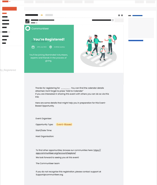
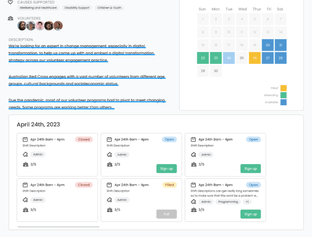
Rostering
Many not for profits utilise emails and other traditional systems in order to schedule their volunteers within their opportunities. Rostering was a different take, trying to make more efficient the process of booking in volunteers into potential events and roles.


How might we…
The challenge here was implementing an easy to understand rostering add on to an existing opportunity creation framework. This meant making changes to both the back end infrastructure as well as the front end opportunity creation and opportunity view.

Reducing cognitive load
Rostering and "shifts" entail three states: Open positions, at capacity and joined. As a result, adding a colour key showcasing such states would allow less back and forth when interpreting information from the volunteer's perspective.
Lateral Thinking
Using what works can help users better understand and navigate your user interface. Utilising a tab system to showcase available shifts on a given day provides a simple yet effective

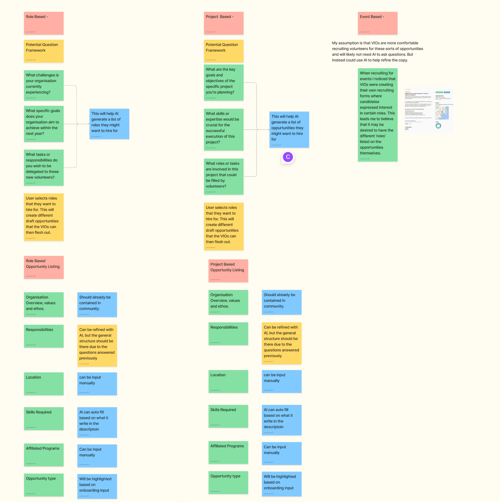
AI Opportunity creation
Talk about question framework
NFP managers tend to be on the older side with a high level of tech resistance; so ensuring the user flow is as simple and as clear to navigate as possible was a must
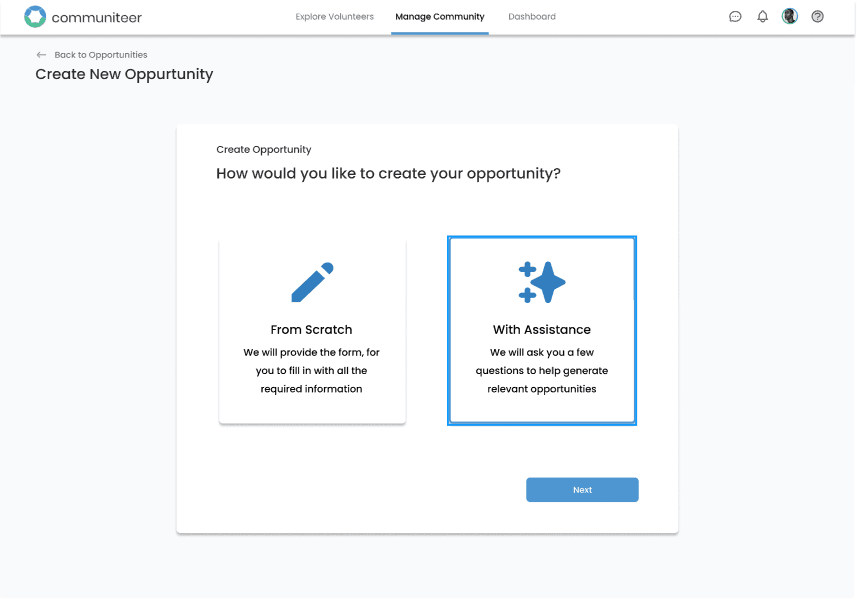
providing the option of traditional vs "assisted"
Utilising vocabulary that caters to the target demographic; most NFP managers would freak when hearing AI (thinking their jobs will be taken).
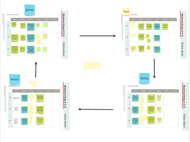
Utilising design methods to bring out the best in interns
Understanding how your team works goes a long way in generating optimal results. Seeing as some interns that I was supervising were more reserved, I chose brainwriting 3-6-5 to allow them to express their ideas without having to take the spotlight.

Usability testing
Ensuring that the product will perform optimally, usability testing was done to identify any mishaps that users may come across when going through the opportunity creation process.